Studio blog by brand stylist, Rachel Reiter, to help you keep up with the latest on studio news, business branding, marketing and design.
What is a sub-logo?

“What the heck is a sub-logo and why do you need one?”
Excellent question. I’m so glad you asked.
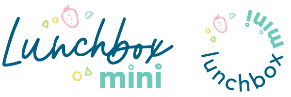
A sub-logo is a smaller, alternate version of your main logo. It borrows the graphical elements, fonts and colour palette, then fashions them into a version that can be used for different applications. Sub-logos can be any shape. They usually form a more succinct, compact version of the logo. Sub-logos are quite often round to allow flexibility of use for social media profile images, watermarks, favicons and packaging.
Let’s take a look at an example.

Lunchbox Mini’s branding identity features a horizontal shaped logo and custom illustrated icons forming the logo mark. In certain situations this may look out of place, be difficult to read, or simply not quite ‘fit’. Imagine trying to squeeze her into a narrow, vertically oriented blog advertisement! Eep!
Still not quite sure why you need a sub logo? Read on my friend.
*trumpets sound* Enter the sub logo! It is perfect for small...
How to find your perfect logo designer

Find your perfect logo designer
Wondering how to find your perfect logo designer? Here are four simple steps to finding a trustworthy designer (and avoid having your logo stolen!).
Recently I shared a conversation I’d had with a lady who had had her logo stolen and presented to another business owner as an original logo concept, that she actually paid a designer for! Craaaaazy, right?! Think it won’t happen to you?
Truth be told, I hear stories similar to this ALL. THE. TIME. So, as promised, here are some simple tips on how to find a trustworthy logo designer who will create an original logo for your biz-baby.
- Ask for recommendations for graphic designers, branding designers or illustrators who specialise in logo design
Chat to your friends in business who have STELLAR logos and/or branding identities. All the better if they’re in a similar industry and align with your own target audience. Please, please, please avoid Fiverr, DesignCrowd and other overseas freelancer websites...
Why do I need more than one type of logo?
Wait, WHAT?! You might have your logo already, you might not. Either way, don't be alarmed by the title of this episode. It's never too late to add items to your brand toolkit that are going to help you elevate and up-level your brand.
You might not even realise that you need more than one type of logo, or what the logo types are and what they're used for! In this episode, I'll tell you the danger in only having one type of logo, and what you need in your brand toolkit to make sure you’re prepared for any situation your marketing collateral requires of you!
Grab your pen and paper, because you’re going to want to brainstorm after listening to this episode.
If you're brand new to business and aren't even sure what your logo should be, or how to communicate your message clearly and confidently, head on over to Brand Alchemy to learn more about my signature brand foundation course. Sign up to the VIP waitlist while you're there to find out when the next course is running. I'll be annou...
Where the heck do I put my logo?
So you have your shiny new brand toolkit, freshly downloaded from your designer and you're ready to start sprinkling your brandy joy all over your marketing collateral. But... wait... where the heck do you place your logo?! You start to second guess your self-taught design skills, your palms are sweaty and so you spend hours shuffling the darn thing around your Canva artboard until you give up and plonk it somewhere... anywhere!
I feel your pain lovely! You weren't gifted with stellar design skills when you signed up for this business gig. Listen to this episode and I'll set you on the straight and narrow as to where you can strategically place your logo for optimum recognition and retention.
Now, logo placement really does depend on the purpose and application of the marketing collateral in question, but this pro tip is specifically for promotional pieces and advertisements.
Enjoy! Rach x


